UX for Work Visa Platforms: What We Learned Designing Zipmi
In regulated products, more instructions don't reduce errors: they stall users with low digital literacy. Here's what we learned testing Zipmi with real workers.

When a product is born in an industry full of legal rules, the challenge is rarely visual; it's getting the system to handle all that regulatory complexity without overwhelming the people who use it. That's what we lived through while building Zipmi, a platform that centralizes the U.S. work-visa process, bringing applicants, employers and legal agents together in one place.
From assumption to user
As an early-stage product, we faced a double challenge: designing the platform while structuring the visa rules from scratch. In that first stage we fell into a trap from the start. Knowing that a single data error could get a visa rejected, we designed the first flows packed with guides, warnings and on-screen instructions, assuming that the more explanations users had, the better we'd avoid problems.
Field testing with real workers broke our hypothesis against two realities: different levels of digital literacy and a paralyzing fear of making mistakes. They knew their job opportunity depended on this process and, far from helping them, seeing so many instructions at once froze them. At the same time, their own lack of confidence with technology meant they constantly needed to know they were on the right track, so we couldn't leave the interface silent either.
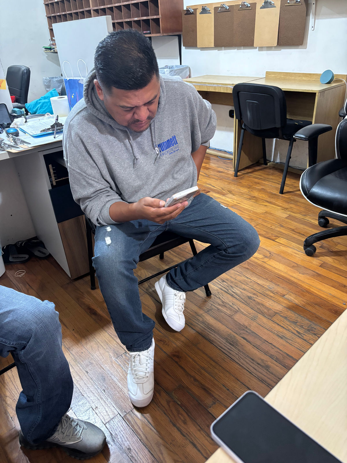
Field testing with real workers.
Functional prototyping with AI
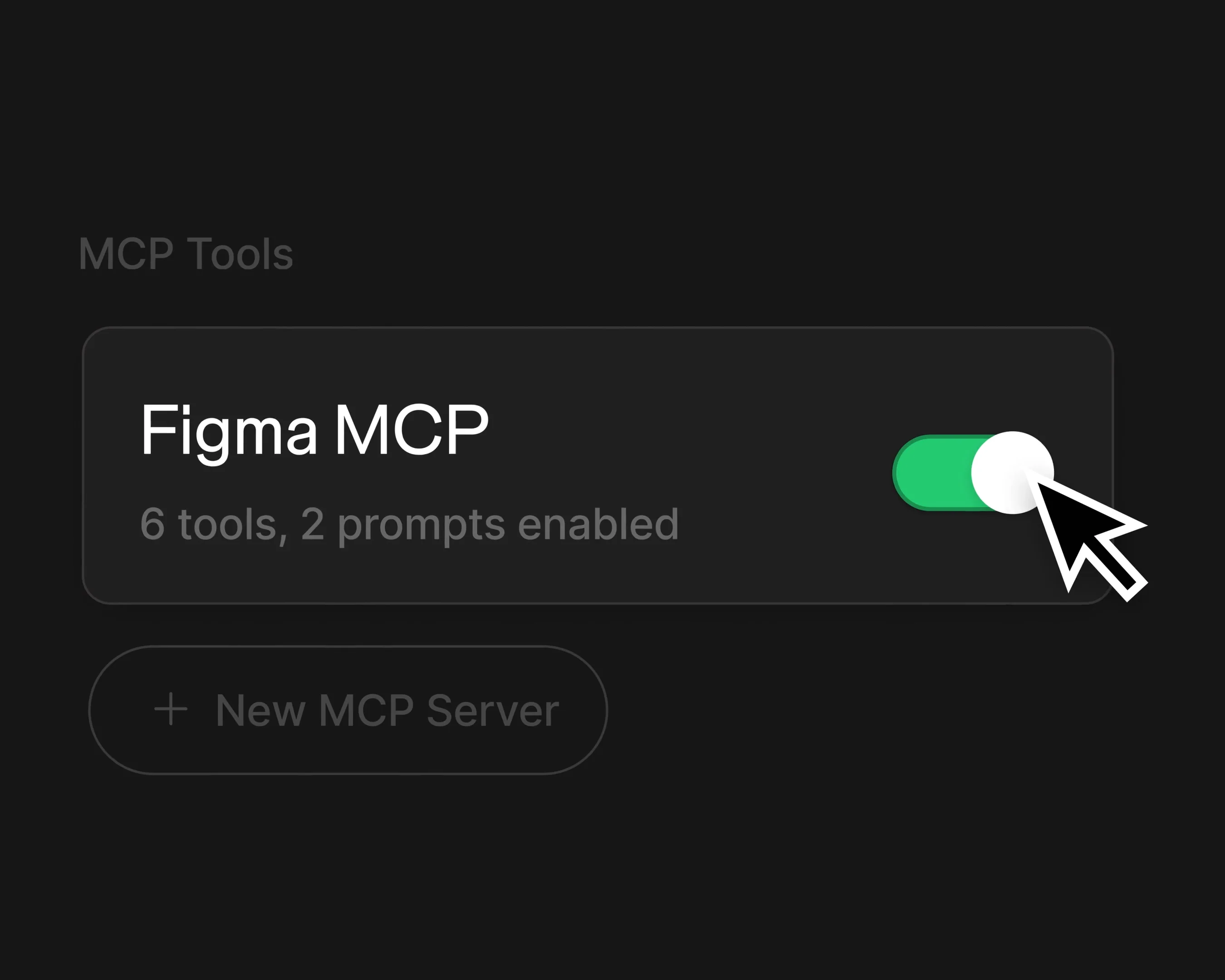
Turning those findings into real solutions required changing the way we design. We never set Figma aside, but we transformed its purpose: we stopped delivering static files locked into the happy path and took the design into a living environment where we could experience how real navigation felt. I started building the first functional versions on Vercel, but when I noticed the result wasn't as faithful as we wanted from a design standpoint, I moved my workflow to Antigravity.
There I managed to combine exact visual fidelity with the real logic of the process. I integrated our design system into the environment and trained custom agents with product-specific skills; with that foundation, making changes or adding features became so fast that we iterated directly on the functional prototype without designing anything in Figma first.
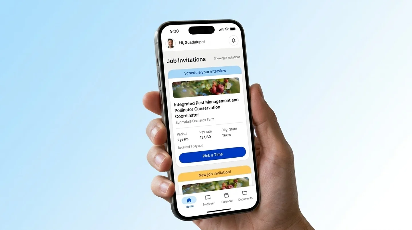
Having this living environment let me tackle the root of what was holding users back in testing: we were asking workers to understand and manage the process, when all they needed was to be guided. Using the prototype to simulate how the business rules connected across the different profiles let me restructure the product to absorb that complexity: I removed from the worker's view any management decision or open-ended navigation that made them hesitate, and turned their experience into a step-by-step sequence where the system validates, supports and confirms their progress at exactly the right moment, while shifting all the operational load and exception handling to the employer's profile.
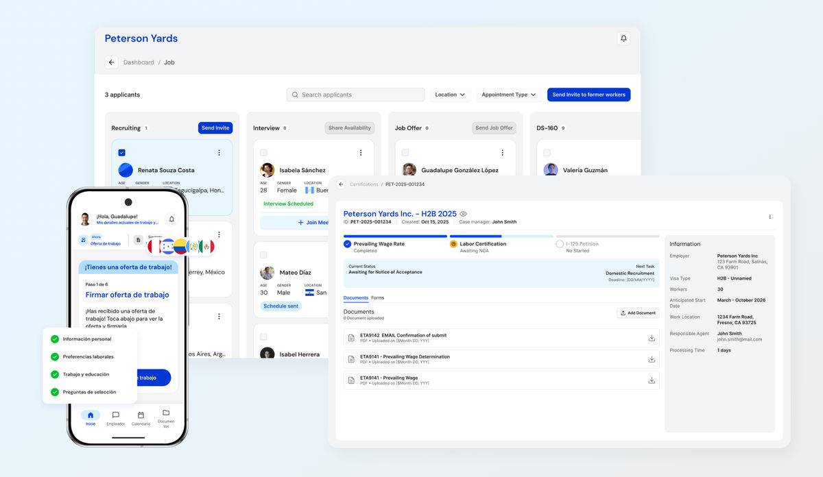
Workers move step by step on mobile, while operations and exceptions live in the employer's profile.
The level of robustness and fidelity we reached with this way of working was such that the prototype went beyond my design desk: it became the official demo our CEO used to present the product and raise investment, showing a platform that looked and responded like real software.
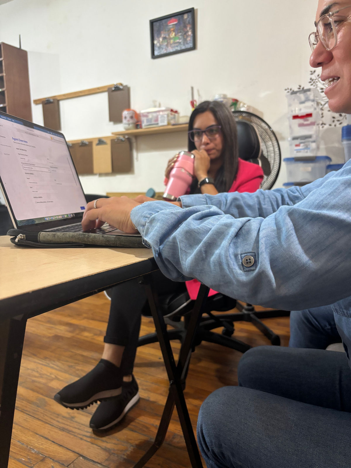
The functional prototype, turned into the product demo.
Recalibrating our judgment
Building Zipmi showed that true simplicity in a complex system isn't about removing elements for the sake of it, but about stress-testing the logic of the journey through design before it reaches production. Evolving my workflow toward agentic environments and high-fidelity prototypes didn't just speed up the business and make fundraising easier; it helped me understand how to build trust through the flow itself — a way of working and understanding users that laid the exact groundwork for tackling even denser projects later on within the same immigration ecosystem.

Steph Villegas · Designer
Product and interaction designer based in Mexico City, focused on clear, intuitive interfaces across web platforms, mobile apps, and complex software. Steph turns dense product requirements into structured flows and cohesive component systems. At Shortcut, she works hands-on across end-to-end product design, from early architecture to production-ready UI.