Soy
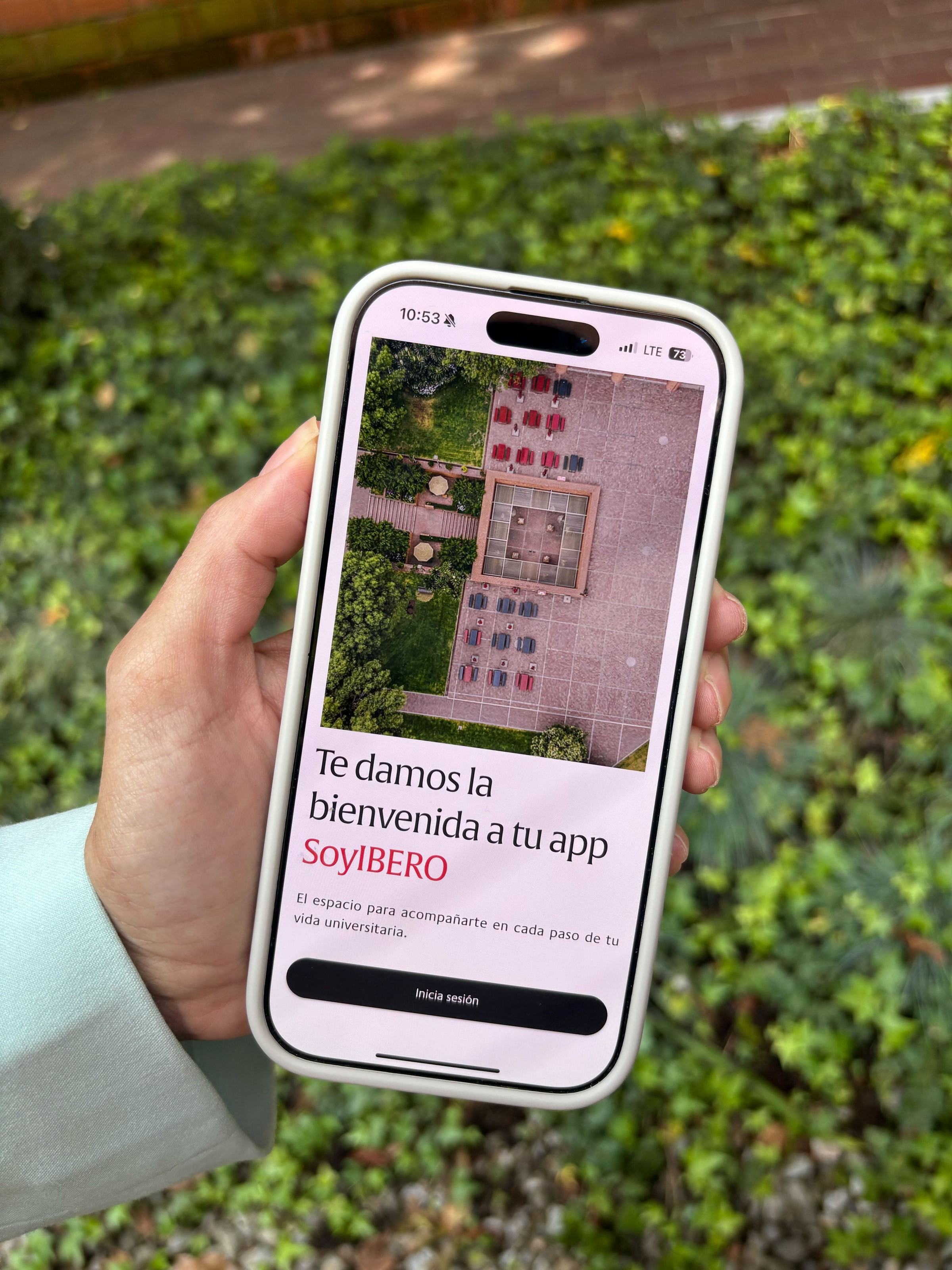
IBERO: Bringing a University App into the Present

Team
Jay, Damian, Estefania, Fabian
Industry
Education
Year
2025
Services
Product Strategy, UX/UI Design, User Research
IBERO’s mobile app was stuck in the past — outdated, confusing, and largely abandoned by its users. With a 1.45-star rating and frequent complaints, it had become more of a pain point than a helpful tool for students.
The university needed a shift, fast. Not a full reinvention, but a product that actually delivered on what students expect from any basic app today: speed, clarity, and functionality.
We partnered with their internal tech team to rethink the app experience from the ground up — and launch a new version in just 16 weeks.
Transforming a legacy app into a modern student tool
The Shortcut
Less reinvention, more resolution
The biggest shortcut was knowing when not to start from scratch.
Instead of rebuilding everything, we recognized where solid work already existed — in the backend, in design tokens, in partial UI components — and focused our energy on making it usable, fast, and meaningful for real users.
That meant working closely with tech, keeping scope tight, and always putting usability over novelty.
In the end, we launched something better not by doing more — but by being intentional about doing only what truly mattered.
The Outcome
The new SoyIBERO app launched on time — rebuilt (design and develeopment) in just 6 months without cutting corners on quality.
While the first version is still gathering feedback in production, early signals are promising:
Internal teams are aligned and proud of the result
The user experience is significantly smoother and more intuitive
For the first time in years, students are engaging with the app as a useful part of campus life
Even more important than features or polish, the project proved something critical:
When design and development collaborate from day one, things move faster — and better.